Monday, January 30, 2017

Animation Analysis: Kiki's Delivery service

Kiki's Delivery Service is, all in all, a very light hearted and cheery film, and I think the backgrounds throughout the film reflect this. They present Kiki's story of becoming independent in a bright, exciting and optimistic way, with the typically beautiful Studio Ghibli art style. There is harrdly a dark  moment in the film. I think the pastel colouring they have used in the backgrounds throughout the film is extremely appealing and calming. According to Miyazaki, the movie portrays the gulf between independence and reliance in teenage Japanese girls. Perhaps this explains why the colours used were so typically visually appealing to girls. The beginning of the movie shows Kiki arriving at the seaside town, using bright colours that indicate the exciting promise of adventure in Kiki's new independent lifestyle.
 The scene below is one of my favourites, I love the pastel colour palette that's been used. I think it looks incredibly serene and peaceful with the calm blue sea and the indication that the sun is just about to set and the town is clearly at peace.
Almost every scene in the film seems inviting and homely, evoking a sense of calm in the audience with pleasant greenery and soft colours, not a scene in the film is ominous. I particularly love how the architecture in the town of Koriko looks very french and endearing.


Friday, January 27, 2017

Finished Character


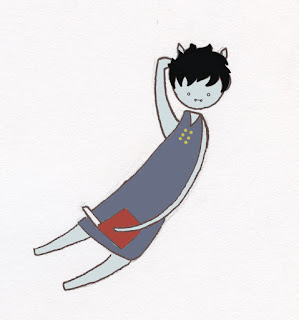
Below is the final design for my vampire character, Victor. I decided to colour him with bluey- grey skin to indicate his undead-ness. I also decided to go with typical vampir-ish colours for his clothes, like dark blood red for the cape and midnight blue for his dress suit thing. I have pictured him in a few of his poses; he is a very leisurely vampire with no friends, so he takes joy in reading and sleeping upside down.
I have also made a gif of my final turn around below; I found this quite challenging to achieve, particularly the poses in between each quarter pose, but by using a lightbox I think I did alright in the end considering I've never done a turn around before. I also found his feet quite hard to keep in the same place. Colouring the turnaround digitally has benefitted me as I have never done anything like this in photoshop before, and spending so long colourng Victor helped me to learn alot about the program that will benefit me in the future and make me less afraid to use it.


Tuesday, January 24, 2017

Animation Analysis: Song of the Sea

Song of The Sea is a stunning animation by Cartoon Saloon that focuses on Celtic myth. This mythology is clearly woven into the beautiful hand drawn backgrounds throughout the film, with spiralling designs inspired by Celtic folk art.
The film begins with a background that reflects the lightheartedness of Bens-the main characters- childhood. The first scene presents such a tranquil and serene image of the clear blue sky and the sounds of the sea that we immediately feel engaged emotionally. The colours are very inviting and vibrant and especially appealing to young children, although I think the art throughout the entire film make it appealing for all ages, especially when the more mystical side of things come in.


This colourful scene contrasts with the later scenes, after the children have been sent away to Dublin to live with their Granny. I love how these scenes juxtapose completely the scenes at the beginning, looking dirty, smoggy and ominous unlike the open brightness of the scenes by the sea. The browns and greys of the city contrast deeply with the deep greens and blues of the sea.
One of the most visually striking scenes in the film is when Ben meets the Great Seanachaí, meaning 'bearer of old lore,' who tells him where his sister has gone. 

This is one of the most mystical moments in the story and I think the colours chosen for the scene really reflect that mystery and intrigue, especially the shine on the Seanachaí's hair which adds to the magical feeling of the scene. At some points in the film I was reminded of the backgrounds in Miyazaki films like Spirited Away, perhaps because of the painterly qualities and the bright and appealing colours.
My favourite thing about this movie

Tuesday, January 17, 2017

Animation: Process and Production week 1


We were introduced this week to our next module, Process and Production. Our very first brief in this module is called "Make em laugh" and we are required to make a slightly longer animation of 25 seconds that features a humorous narrative. We are also required to follow a production workflow for this project. At the minute I am finding this brief very intimidating for a few reasons; firstly it is the biggest project we have been given to date, with the longest required time and also must have audio etc, and secondly because I am worried that the ideas I have won't be perceived as humorous by my audience.
I began brainstorming ideas under the different titles we were given by Mat; I thought of different ideas which I have pictured below, brainstorming using a spider diagram. The ideas I liked the most at this point are "A Birthday to Remember"- I thought perhaps I could relate this to the nativity story and try to make that funny, and the "First contact" idea, maybe with animals first meeting eachother, and in particular the idea of a sloth interests me because I think they are funny creatures. I also thought of the idea of an actual 'blind date', as in the fruit. I think this could be funny to many varied age groups but particularly the one I'm aiming for. We were told by Mat to try and decide on a target audience first; I am considering targeting my animation for young people, maybe around my age or younger.
I like the idea of dogs meeting eachother for the first time, or maybe for the First Encounters title I could animate a girl who sees someones dog for the first time and tries to steal it in different ways. When I thought of this idea I remembered the HOUND animation by Georgia Kriss. I really liked this animation and it definitely is my kind of humour, especially because it has dogs in it. I have linked the animation below;
https://vimeo.com/149238162

Monday, January 16, 2017

Life Drawing- Strike A Pose

 I found the 'Strike A Pose' task much easier because it gave me time to work how I am used to, drawing details and considering the weight and pose of the subject. I used a 4B pencil to do these drawings and drew my friends casually posing while they did their own work. I struggle to do the detail on faces from a bit of a distance so this is something I need to improve on. I am going to rejoin life drawing again to try and improve this. I also found I didn't have enough time to do all the detail I would have liked, as time management has always been a problem for me and a point to improve on. I also think I sometimes draw the head of the figure too small in proportion to the body.

Thursday, January 12, 2017

Life Drawing- Push it

I think this was my favourite task in the Form, Flow and Force study task because I enjoy the challenge of trying to portray the weight and force of an object through drawing. I used markers, watercolours, graphite and inks for this task. I think ink and water worked best for this because it can be easily blended to show the darker and heavier lines and also the lighter areas of a body, as well as keeping a fluid and less harsh look in the drawing.

Wednesday, January 11, 2017

Skyward Sword Animation Analysis

Skyward Sword is one of my favourite games of all time; I have always loved the vivid colours in the game and the different areas you can access. The game begins on an island in the sky called Skyloft; it is so incredibly bright and inviting that you could spend hours just looking at it alone. The warm inviting colours of the entire island connote to the fact that this has been this version of our hero, Links, home for his current life span, before he is thrown into another world of chaos and terror on the land below.


Links home town of Skyloft
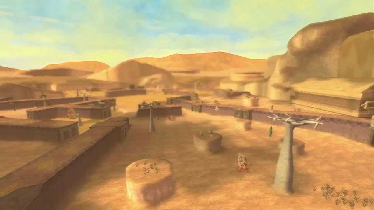
This lush and colourful comfort zone contrasts with the strange new worlds below the clouds that Link must brave in order to find the princess. The surface presents new dangers that our hero has never faced before; many time these backgrounds are bare and dry, completely contrasting to the safety of Skyloft. These locations include deserts, volcanoes, haunted woods and even a silent realm. These scenes are still beautiful, but in playing the game I find that they can genuinely be quite intimidating even though there is no real danger. The colours juxtapose with those used in Skyloft, signifying the evil thats there before Link can conquer it.


Tuesday, January 10, 2017

Life Drawing Progress- Like A Puppet on a String

I found the 'Form, Flow and Force' study task to be particularly challenging. I found it difficult to convey some of the squash and stretch movements, particularly the movement of a sideways kick. I think this was because I didnt have the time to add any shadow to the movement and perhaps this was not a movement that I should have done in water colour, however I liked using different shades of water colours in the other squash and stretch movement I did because I think it helped to convey the idea of movement and the water colour helped with portraying the fluidity in movement. I think the different coloured markers I used for the other poses in this task worked well because they allowed me to get a solid but precise line down, and also changing between colours for each pose here I think helps capture the idea of the movement being performed.


Wednesday, January 4, 2017

Life Drawing- Rhythm is a Dancer

Below are some examples of my work from the  Rhythm is a Dancer task of the Form, Flow and Force brief. I actually found this brief alot more challenging that I thought I would at the beginning, particularly with these poses which were only held for a number of seconds. I think this is because I have been so used to doing more of a fine art approach to life drawing in the past, so I was concentrating too much on details rather than capturing the movement of the figure. I think I eventually got the hang of it though and began putting less thought in how good it looked and more into if it actually showed movement. I used different materials for my life drawings, from thick graphite pencil to marker and water colours and inks. I liked using markers most for capturing movement and changing the colour of the markers between poses really helped.
I also found a video on vimeo that helped me understand how to draw in a quicker style to complete the poses faster, which really helped me to define which are the key features you have to get in to capture the movement. I have linked the video below;
https://vimeo.com/52869345