Over the break I have been making progress with my individual shots for the animation. Below is the shot I've been working on the most recently. I am quite happy with how it is looking but i would like to add more in betweens to a few of the movements to make them smoother and more natural- for example the spider legs and when my character turns her head. I also intend to add some smoke effects to the shot, but at the minute I am focusing on finishing my other shots first.
Thursday, December 28, 2017
Thursday, December 14, 2017
Shot 1
This week I began making progress on one of the first shots of the animation. In this shot, we see the character for the first time as a silhouette appearing on the other side of a window. I went about this by using the following reference video from youtube. I found it easier to understand the walk cycle and get it right by drawing the entire body, despite the fact that you wont be able to see below the waist in the finished shot. I have never done a walk cycle from this view before, but thanks to the reference video i found it much easier, and then added the details like the spider legs and hair to show the character.
Monday, December 11, 2017
Walk Cycle Progress
This week i have been focusing on the shot i keyframed of the spider ladys walk cycle, mainly adding more detail and the characters characteristics, but i still have to add more details and clean it up alot. I am however happy with how its looking and the progress Ive made. I struggled a bit with keeping the details consistent in each frame, like the hair and dress, but i went through and re did it and now i think they are more or less consistent. I also am pleased with how the movement of her dress is looking; watching Jessica Rabbit reference videos really helped with that to see how the movement should look. I am spending quite a lot of time on this scene because i really want it to look right.
This is how it looks at the moment.
Character and narrative key frames
I have begun keyframing some of Spindra the spider characters actions. I found the walk cycle particularly difficult because of the angle of the background and i had never done a walk cycle like ths before.
Tuesday, December 5, 2017
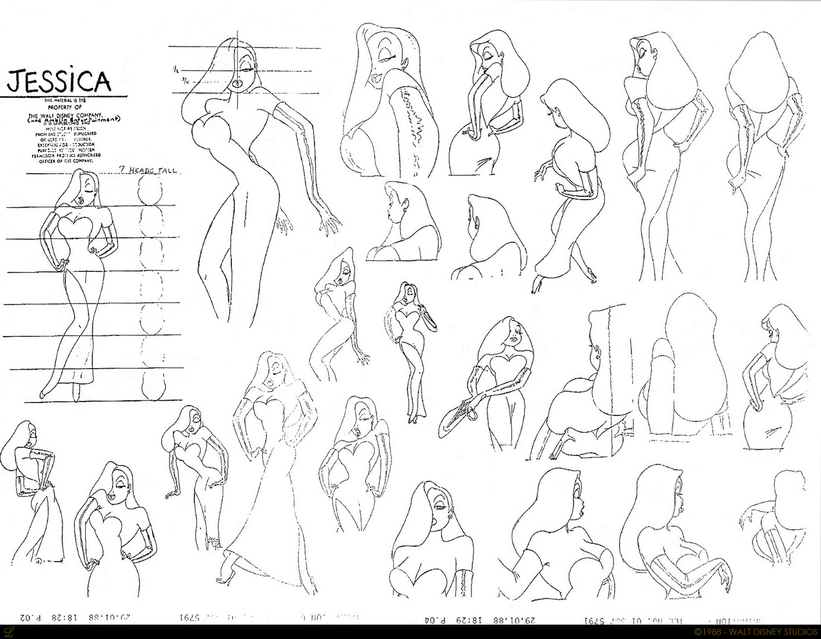
Jessica Rabbit research
I have found researching Jessica Rabbit very helpful in animating and designing Spindra, the sexy spider character in our animation. She has been especially helpful when i was struggling with my characters walk cycle, and when observing how her dress and hair should move. I learned how to make my characters walk more exaggerated and sexy from studying the scenes she appears in in "Who Framed Rodger Rabbit" and also used her character design sheets as inspiration when designing my own character. I found the sexy walk difficult to get right but these videos helped me alot, even though my walk is not as exaggerated as in the film.
Sunday, December 3, 2017
Backgrounds
After some deliberation, I have decided to use the backgrounds I created in Maya by themselves and not to paint over them. Painting over them proved to be very time consuming, especially because i wanted to keep the lighting effect I had acheived using Maya, and in the end some of the ones i painted over simply looked worse than the maya screenshots. I also received feedback from peers about how much they liked my backgrounds and now feel confident enough to use them in the final animation. I also think this may make the 2D animated parts of the animation work better alongside Alice's 3D flashback part, perhaps making the switch from 2D to 3D less jarring. I regret having spent some time painting over the backgrounds but I have learned from this mistake.
Tuesday, November 28, 2017
Character and narrative- Background progress
I have been concentrating mainly on painting over my 3D modelled backgrounds in Photoshop recently, which proved to be a much more time consuming process than I first expected. I had alot of trouble painting the shadows and getting the perspectives right. I eventually figured out a more efficent way to do this; by using the polygon selection tool and then filling in the selection with a gradient, I lessened my workload and was able to work much more quickly. I have also begun doing keyframes over the unfinished Maya backgrounds which are acting as placeholders at the moment.
Tuesday, November 21, 2017
Character and Narrative walk cycle test
This week I have been working on a walk cycle for Spindra, the sexy spider character. Below is the very rough test i did. I took inspiration from jessica rabbit walk cycles, but toned down a bit in the exaggeration aspect. I am really pleased with how this turned out and our group has decided to use it as one of the shots in our animation. Next step is to clean it up and add detail etc. I had a bit of trouble with the second step but eventually went thorugh it and fixed it.
Wednesday, November 15, 2017
Study Task 3- Strike A Pose
These are my responses to the 'Strike a pose' study task. I enjoyed posing moom and getting to know maya a bit better. I found it useful to get the degree of exaggeration i wanted which I couldnt achieve in my reference photos. Because i havent used maya since first year, it took a bit of getting used to, but i now feel much more confident using it having completed this task.


Monday, November 13, 2017
Spindra Character Sheet
Below is a character sheet for Spindra showing a range of poses which i think show her character well. I took inspiration once again from Jessica Rabbit character sheets.

Tuesday, November 7, 2017
Character design
Below is the finished character sheet for the spider lady character which I designed. We have decided to name her Spindra. I was heavily influenced by Jessica Rabbits character design because we are going for the same exaggerated sexy character type with Spindra. I tried a few different colour combinations for her dress/hair/skin but settled with this one because i think it compliments the other colours nicely and is obviously Jessica Rabbit inspired while also remaining unique and spider-y. The biggest challenge was drawing the different angles and the way her spider legs would look from the back and side, but I am happy with the character sheet and how the character looks overall.

Friday, October 27, 2017
Potential and Limitations - Technique
Our group differs from most of the others in that half of the animation will be in 2D, and half in 3D. I had my doubts about whether this would work aesthetically or if it would appear jarring, but after discussing with my group more i think it is best that we each work to our individual strengths and think it will actually make a very interesting result. Tom and I will be animating our parts of the animation in 2D, while Alice does hers in 3D. I chose 2D as it is the medium I am most comfortable working in. I think there is a possibility working in 2D will look very flat in comparision to Alices 3D sequence, but i will try my best to avoid this. I am very interested in learning more about 3D but I am not at the skill level where I would be confident in animating in 3D. I have been modelling the backgrounds for the 2D parts of the animation in 3D however, which has allowed me to gain more understanding of the software and to feel more comfortable about using it in future projects. We didnt consider stop motion for our animation because none of us have ever worked with the medium before, and because aesthetically i dont think it would have fit the mood we are trying to achieve in the animation.
Wednesday, October 25, 2017
Potential and Limitations-Process
To Animate my parts of the project I will be using Adobe Animate. I have decided to use animate because I find its timeline much easier to navigate than photoshops, and in general I am much more confident using it as I have used it for the majority of my animations. One of the downsides of animate as opposed to Photoshop, however, is that there is much less variety of brushes, and photoshop has more tools to make the animation look better aesthetically, but I think the pros outweigh the cons in terms of this project because I am not as used to Photoshop and thus it would take longer. After being introduced to TV Paint, I was really enthusiastic about using it to animate with as I found it very simple and intuitive, but because I dont have access to it outside of Uni It would be detrimental to my project and also put alot more pressure on me to finish my parts of the animation while I still have access to it.
Tuesday, October 24, 2017
Character and Narrative backgrounds
I have been working on some backgrounds for my groups character and narrative animation. Currently I have been working on the background for the rat detectives office. Because our animation is going to be a noir film style, I researched some classic 50s looking detective offices which id seen in games like Bioshock and different detective films. I took inspiration from these and designed my own office in Maya, which I plan to draw over in photoshop. I am learning alot more about Maya just from modelling the office as a guide for me to draw over and am really enjoying it. After adding lighting i felt it really acheived the effect i was looking for.

 |
| After adding lighting |

Sunday, October 15, 2017
Character and Narrative progress
We pitched our story ideas to the class on friday who then voted for which one we should make. In our group, Alice's story was chosen. Her story is about a rat detective who has an encounter with a spider lady and has an noir 50s theme. I am happy this was chosen as I really like the story and think there will be a lot of cool concept art etc that we can do around the story. We each drew out our initial ideas for the character designs and also talked through the different aspects of the story and the script. I am very interested in doing some background designs for the animation as well as some concept art and character design. We came up with some basic ideas for how the characters would look. Below are my designs for the spider lady character. We want to make her really over sexy, taking inspiration from Jessica Rabbit, but for there to be some comedy in the fact that she has a gross spider mouth.


Thursday, October 5, 2017
Telling Tales
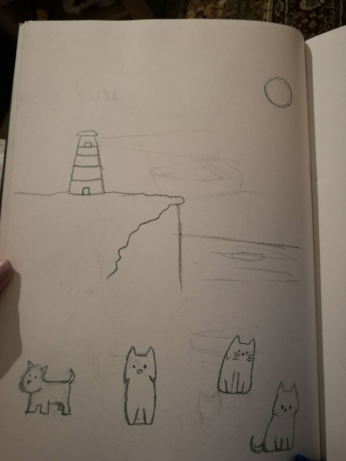
The symbols I rolled with the story dice for this brief were a lighthouse, a cat and a wolf/dog. I was really happy with this because it immediately brought to mind images that I thought i would like to create an animation around. I immediately thought of a few ideas and did sketches around them and finally came up with an idea I really liked. My idea is about a dog and a cat who live by the sea in a lighthouse and like to look up at the moon. They see the moons reflection in the water one night and decide to sail out to try and catch it. They pull the moon out of the water and bring it back to shore, where they play games with it and eventually the cat accidentally bursts the moon with its claws. I think this could be a really cute idea and stylistically I would love to do the backgrounds and have the whole animation in black and white and in quite a cartoony style to compliment the story.
Below are some sketches I did of my initial ideas and some character design, as well as a few poses to get see what dogs and cats look like in motion.


Below are some sketches I did of my initial ideas and some character design, as well as a few poses to get see what dogs and cats look like in motion.


Thursday, May 18, 2017
Maya Animation
Although i found it difficult to get my head around at first, i actually really enjoyed testing out animating in maya. It was alot easier than it looked once i understood it. I did have a few problems as the first three times I tried to playblast the bouncy ball exercise Maya crashed and lost everything i had done. I found the way the keyframes worked was very simple, and liked how the different features that allowed the assets to be influenced by the 12 principles, like squash, worked. I was intimidated by maya animation before but now i feel i could possibly use it in other work in the future. It was actually much easier than a program like animate to fix things like timing if you animated something too fast or slow.
Wednesday, May 17, 2017
Modelling in Maya
I was originally really intimidated by Maya because it looked so complicated and professional, and I did find it difficult to remember all the different keys and work out how to do things, but after following the guides on estudio and practising a bit more I found it was easier than it looked to begin with. It took a while to get used to the different controls and remember where things were, but the truck exercise helped me so that when I went on to trying to modelling something of my own choosing I had a bit of knowledge of what to do. I decided to make a water bottle that was on my desk at the time. Since then said water bottle has been binned so I cant post a picture of it unfortunately. I started making the water bottle by creating a cylinder shape, which i lengthened and beveled alot to make the edges more curved. I then used more cylinder shapes which i beveled to create the top half of the bottle, and another smaller and thinner one for the lid. I set the segments of the bevels differently to get different degrees of curves. Once I was done I coloured it using a shiny blue colour which i think worked well. I am overall pleased with my bottle.
OUAN406- Final Animation
I have just finished tidying up my animation and fixing the timing a little bit, as well as adding some details like desks in the first scene and putting in the backgrounds. I scanned in my oil pastel drawings for backgrounds, but found that because there was such a dramatic zoom in my animation at the beginning, the quality was bad and it distracted from the animation. I fixed this by using watercolor effect brushes in photoshop to get the abstract effect that my group agreed on and then importing the different backgrounds into animate. I really like the finished look of the backgrounds.
I also added in the desks around my character in the first shot, which i faded out using the alpha effect in animate and i think this makes the animation more effective because it shows how intimidating the room seems to my character. I downloaded a VCAM to do the dramatic zooms and to follow around the different moving elements of my animation so it is all one continuous shot. If i had the time I would like to make my animation more polished, for example I'd like to frame by frame the fly more, especially when he lands, because he should be more flat here, but i didnt have time to fix it. Overall, I am really pleased with the final animation, especially because i was so intimidated by the brief to begin with.
Saturday, May 13, 2017
Applied Animation final crit
On tuesday we had our final critique for the applied animation module. The feedback we received as a whole was positive; everyone agreed that our three animations tie together nicely and that they each illustrate the point we were trying to make about how hard having autism can be. Individually, the feedback i received was that my transitions worked and flowed really well and the voice over really lended itself to the animation. Negative comments included rethinking some of the shot framing, as at this point a few scenes werent centered properly, which i knew was a problem, and adding backgrounds, which I havent got around to yet. I have made a few oil pastel backgrounds which i scanned in to test with the animation, and found that because of the zooms the quality is really bad at points, meaning ill have to rethink some of these and maybe use a different medium or do some backgrounds digitally.
National Autistic Society brief progress
Over the last week I've been working on my autism animation. I found it really challenging to begin with because I havent really done anything like it before, and i was intimidated by the amount of difficult zooms and morphing that I had to do. The animation also has to be one continuous shot in order to fit our groups theme and so they all flow together. As usual, i put off starting for a bit because of this fear that I wouldnt be able to do it, but once i asked Matt and a few people more adept with Adobe Animate than me, I just went for it and the results arent terrible. I had to draw my character from above for the first shot, so I had to take a few reference photos of people from a height to get this to look right (it took longer than it should have.) After this, I had to work out how to morph this image into the buzzing fly which comes next. I achieved this by experimenting with different in-betweens until i found one that looked like a natural transition, and gradually erased the surroundings in the first shot frame by frame so they flowed away naturally and didnt just disappear. I think this actually looked much better than i was expecting it to. Next I had the fly land, and also gradually erased it and drew lines sprouting from its legs that would make up a surface for the hand to write in in the next shot. I found the hand the most difficult part so far, because Ive never really animated something as complex before, so I had to take a few reference videos of my own hand writing and base my animation off that. It was frustrating because each tiny movement made a big difference in how the animation of the hand flowed, so it took alot of practice and trial and error to try and get something that looked natural, but im quite happy with how it turned out. The next part of the animation involved making the pen that was writing morph into a pairof legs walking, to show how footsteps can be distracting in an exam situation for someone with autism. As with the previous transitions, I made the hand flow away with gradual erasing, leaving the pen which i broadened and added a foot sprouting gradually. I used Preston Blairs 'Cartoon Animation' book to help me with the walk cycle, and im really happy with how it turned out, but i think ill have to slow it down a bit for the final animation.
Friday, April 28, 2017
Life, Animated
To research more about autism, my group watched a film called 'Life Animated.' Released in 2016, the film tells the story of an autistic man called Owen Suskind, who has used Disney animated films throughout his life as a way to understand the world around him. The documentary was really touching and helped me to understand what life is actually like for autistic people and also gave me a new appreciation for Disney films because the effect they had had on Owen's life was obviously profound. He used different scenarios in the films to overcome challenges in his own life and to understand the world around him,he applied the structure in the films to real life. In one example, he compared himself to Quasimodo from the Hunchback of Notre Dame, to show how he felt like an outcast but now feels he fits in. The film also showed how creative people with autism can be, with beautiful animated scenes showing a world, 'The Land of the Lost Sidekicks' that Owen had created. The animation here was really beautiful and colourful, contrasting with the more sketchy and dark animation that was used at the beginning of the films to show the way the world was seen by Owen before he discovered his coping mechanism. I think this film helped us all understand the mind of someone with autism more and we all took inspiration from it for what we wanted our animations to be like; portraying autism as something not wholly negative. 
Thursday, April 27, 2017
Scripts and audio
Before I began animating, I wanted to get the script written and recorded to have that as a guide. I think audio in our animations is really important, because we want to take a more abstract approach and some of the things happening on the animation will be hard to understand without a narrative. Much of the sensory overload I will focus on in my animation has to do with sounds being distracting for an autistic person anyway, making the script even more important. Ally, Kate and I all met up and each wrote our scripts together so that we could be sure they all flow together and have a similar feel. I based alot of my script off the information Ally had gotten from her autistic friend about why exams are difficult for her. Here is what she said;
- Explain to me what to expect in advance ....otherwise I will imagine all sorts of things that might not happen and I will get over anxious unnecessarily
- Don’t make me sit too close to other people ..I cant stand it
- I need to wear my headphones to listen to music and block everything out
- Everybody needs to know that I have to rock when I am concentrating ...I cant help it
- Switch the lights off...I cant stand the flickering....I will get obsessed by it and be too distracted
- I hope nobody is wearing smelly perfume or washed their hair with lemon shampoo
"Exams can be really difficult. I can’t stand them. I get obsessed with little things, like tiny sounds or even smells, and it becomes distracting. I need to block all the sounds out. I can’t help it."
My group and I booked out the sound booth in uni and recorded each of our scripts a few different times, Ally kindly voiced mine for me and I think it will work really well over the finished animation, with the timing coming up at about 18 seconds.
Thursday, April 20, 2017
Autism animatic
Attached is my animatic for the applied animation module. Its very rough and i think alot of the camera angles etc will be different in the final animation, but it gives me a guide around which i can base the timing of my animation.
Tuesday, April 4, 2017
Autism animation storyboard
Ally, Kate and I had a group meeting recently to discuss our ideas for our animations. We all came up with individual ideas and then gave eachother feedback and ideas on improvements or ways to illustrate our points better. All of our animations will be one continuous shot, and will focus on three different narratives about 3 people and their experiences with autism. My character will be called Julia. The animation will begin with a zoom of julia's name, which will zoom out to reveal the rest of the exam paper, with the words on the paper swirling to show confusion. The shot will continue to zoom until we are right above her, and then she will morph into a fly, which will buzz loudly, and land on a table where a pen is scratching loudly. The pen will then turn into a leg walking, taking two steps and then morphing into the hands of a clock ticking. The point is to illustrate how distracting and overwhelming these things can be in an exam situation for a person with autism. I think the sounds i choose to use will support the points im trying to make about the distractions.


Sunday, April 2, 2017
Applied animation
I have narrowed down my ideas and discussed them with my group; I am going to be focusing on the different aspects of sensory overload a person with autism can go through when taking exams. I researched this online on sites like ask reddit, where you can ask people questions like how autism affects their life. I also found some information about how stressful exam situations can be on the national autistic society's website. A few of the things I found out were things like; the overwhelming size of the exam hall, things such as strip lighting, noise, smells, or an invigilator walking around the hall can all be distracting. Ally also talked to a friend she knows with autism who told her about her feelings towards exams; she said a few interesting things like not being able to stand sitting too close to other people, needing to wear headphones to listen to music and block everything out, getting distracted by flickering lights or smells like strong perfume. I think all the information i've gathered could work well in an animation. We as a group have agreed we would like all of our animations to be one continuous shot as opposed to scenes cutting and to keep a more abstract background style. I think this animation will be a challenge as i've never done anything like it before but i am excited to give it a try.
Tuesday, March 21, 2017
Applied Animation- The National Autistic Society
For the Applied Animation brief in this module I have decided to form a group with Ally and Kate and we are going to be focusing on the The National Autistic Society brief. I have began researching and we have discussed how we are going to approach the brief. we are going to do a 20 second animation each on the effects of autism on different people. I think I am going to focus on the idea of sensory overload that is common in people with autism. I have done some research and discussed this with Kate and Ally and we have agreed that we would like to take a more abstract approach to this task. I am really excited to try and achieve what I want to convey, especially because we want to use more traditional media like water colours and other paints and pastels in this brief. I think using different textures as well as media will lend itself a lot to trying to convey the idea of sensory overload.
I have researched and watched videos about how different people experience autism and it has given me a few ideas about how it effects their lives. I have gathered that sound and light is a main effect that can become very overwhelming for people with autism so I think this would be a good thing to emphasise in the animation.
I have researched and watched videos about how different people experience autism and it has given me a few ideas about how it effects their lives. I have gathered that sound and light is a main effect that can become very overwhelming for people with autism so I think this would be a good thing to emphasise in the animation.
Wednesday, March 15, 2017
Blind Date finished animation
Today i adding finishing touches to my animation and also added in sound. I think the sounds I choose work really well in finishing off the animation and adding that extra touch of humour. Overall I am really proud of my animation because I have never animated digitally before and I was quite scared of doing digital animation before this module. The finished animation is below;
Pixilation
I had a few ideas for my pixilation study task; first of all I thought of having people slide down banisters or maybe having a naruto style fight scene, but eventually I decided to use my other idea which was of someone murdering someone else and hiding the body. I planned the storyboard that I have attached below. I used Kate and Tom as my actors and instructed them on how to act and when to pause so i could take the photos. I had them have an argument that got so heated that Tom beat kate to death with a stick and then dragged her body down the corridor to find somewhere to hide her. I thought it would be funny if he were to just put her in the lift and press the button to let someone else discover her. I found directing the pixilation really fun and I loved watching it all come together in the end and experimenting with different types of movements. If I were to do it again I would make sure to remember to take photos of some of the shots as they pan round corners etc, because I think the sudden cuts in my pixilation take away from the flow of it. There were also a few shots that were hard to get, for example when putting Kate in the lift she had to move very quickly or the door would close and I wouldnt be able to get the shot; however I am really pleased with the final outcome and think the story line is quite funny and works well.
Blind Date- Animatic
Below is the animatic for my Blind Date animation. I think i need to fix the timing on a few places but doing this really helped me envision what my final animation will look like. I think i will change it a bit for the final animation, such as trying to make some shots look more dynamic, and I have changed the date getting squished by a foot into him being sliced in half by the automatic doors of the supermarket when he finally makes his escape.
Tuesday, March 7, 2017
Make Em Laugh Final Crit
Today we were split into small groups for our final critique for the process and production brief. I enjoyed doing the critique in the smaller groups because it meant it was easier to get your point across and to ask questions about your work to your peers. The people in my group gave me some great ideas on what I could do to improve my animation. For example, I wasn't sure about one of my shots because I thought it would be too boring and long as it was; they gave me the idea of making the light of the outdoors shine on the date as he is making his escape so it can fade and transition into the next shot where he has made it outside. I think this is a really good idea that will make the scene more dynamic and interesting. They also gave me ideas for what I could do to make my animation funnier- like adding in a date family for my date that are waving him off as he goes on his adventure, or at the end when he gets sliced in half by the doors, perhaps he could put his sunglasses back on as a sign that hes not completely dead yet. They also gave me advice on how to make my animation look better, like makng the doors at the end transparent so its more obvious what they are. The feedback about my backgrounds was good and they seemed to like my date character and the choice of audio i told them i was planning to use. Overall it was a really helpful critique that gave me lots of new ideas and allowed me to get a feel of what others were doing and help them too.
Monday, March 6, 2017
Make Em Laugh Final Shots
For my last few shots of my animation i have ran into a few problems. The 5th scene is too long as the tiny date has to run all the way along the supermarket aisle and i think it might look too boring and last too long. To fix this i might add a transition to the next shot because he is running towards the bright white door, so i think a white fade might look good here and make the scene more dynamic.
For the final shot -the dates death scene- I have designed another background that shows the aisle the date has just escaped from. I am also in the process of making a door with a transparent effect so you can see the background through them and so its obvious what they actually are. I also did this because I want the date to be sliced in half so you can see his 'organs' through the transparent door- I think this will make the animation more funny. To help me with figuring out what this scene might look like Mat showed me a scene from the film 'Thir13en Ghosts' where one of the characters gets chopped in half by a sliding door. I think I will take the expressions seen in this film and try to apply it to my blind date.
For the final shot -the dates death scene- I have designed another background that shows the aisle the date has just escaped from. I am also in the process of making a door with a transparent effect so you can see the background through them and so its obvious what they actually are. I also did this because I want the date to be sliced in half so you can see his 'organs' through the transparent door- I think this will make the animation more funny. To help me with figuring out what this scene might look like Mat showed me a scene from the film 'Thir13en Ghosts' where one of the characters gets chopped in half by a sliding door. I think I will take the expressions seen in this film and try to apply it to my blind date.
Thursday, February 23, 2017
Make Em Laugh Progress
This week I have been working on getting key frames blocked in in other shots of my animation. The third shot of my animation also has a walk cycle in it and after doing this in the shot before I felt alot more comfortable doing it and I think it looked alot better than in the last shot where I had problems keeping the size of the character consistent using frame by frame animation. The next shot was a bit more complex with the date sliding down a rope and jumping off onto the floor. I decided to tween the rope movement to save time but to try and draw him doing a front flip off the rope to make the scene more visually interesting. I was really happy with the final bounce off the rope and tried to use my knowledge of squash and stretch and timing to make it look as good as possible. If I have time I would like to make the part where he slides down the rope more interesting by making him twirl around it or by making the rope sway, because at the minute I think it looks way too still and static compared to the energetic bounce he does at the end.
For the next shot where the date nearly gets ran over by a trolley, I have began by colouring over a picture of a trolley on photoshop which I imported into animate. I then made the trolley into a symbol and moved the rotation of the wheels so it appears as if they are moving, and then tweened the trolley to move across the stage so the date can jump out of its way. I am really pleased with how the trolley looks especially with the wheel moving. I also added in key frames of the date diving out of the way, trying to focus on the timing of the jump and the anticipation the date goes through before he jumps out of the way.
For the next shot where the date nearly gets ran over by a trolley, I have began by colouring over a picture of a trolley on photoshop which I imported into animate. I then made the trolley into a symbol and moved the rotation of the wheels so it appears as if they are moving, and then tweened the trolley to move across the stage so the date can jump out of its way. I am really pleased with how the trolley looks especially with the wheel moving. I also added in key frames of the date diving out of the way, trying to focus on the timing of the jump and the anticipation the date goes through before he jumps out of the way.
Tuesday, February 21, 2017
Make Em Laugh- Backgrounds


Friday, February 17, 2017
Make Em Laugh progress
This week I began animating properly starting with a simple zoom of one of my backgrounds as an establishing shot to depict where the animation is set. I am using Adobe Animate over Photoshop as I find it easier to understand. I was really scared of beginning to animate because I have never animated digitally before and I was afraid of the program, so I think I put it off a bit out of fear. However, when I got used to the controls I found it wasnt as bad as I thought it would be.
I used tweens over frame by frame to show the date jumping out of the box in the second shot and then drew a few key frames of him walking over to begin his escape. If I have time I would like to change the tweens to frame by frame because I dont like how robotic and unnatural it looks, but I really like the frame by frame walk cycle I did. Because I had never done a walk cycle before I had to look up a lot of tutorials on youtube to help. I struggled a bit with this because my dates legs are so small and I didnt know how much they should bend while still looking natural, but after experimenting a bit a making them bend less I am quite pleased with the result. Below is the video I found really helpful in trying to get this right.
I used tweens over frame by frame to show the date jumping out of the box in the second shot and then drew a few key frames of him walking over to begin his escape. If I have time I would like to change the tweens to frame by frame because I dont like how robotic and unnatural it looks, but I really like the frame by frame walk cycle I did. Because I had never done a walk cycle before I had to look up a lot of tutorials on youtube to help. I struggled a bit with this because my dates legs are so small and I didnt know how much they should bend while still looking natural, but after experimenting a bit a making them bend less I am quite pleased with the result. Below is the video I found really helpful in trying to get this right.
Wednesday, February 8, 2017
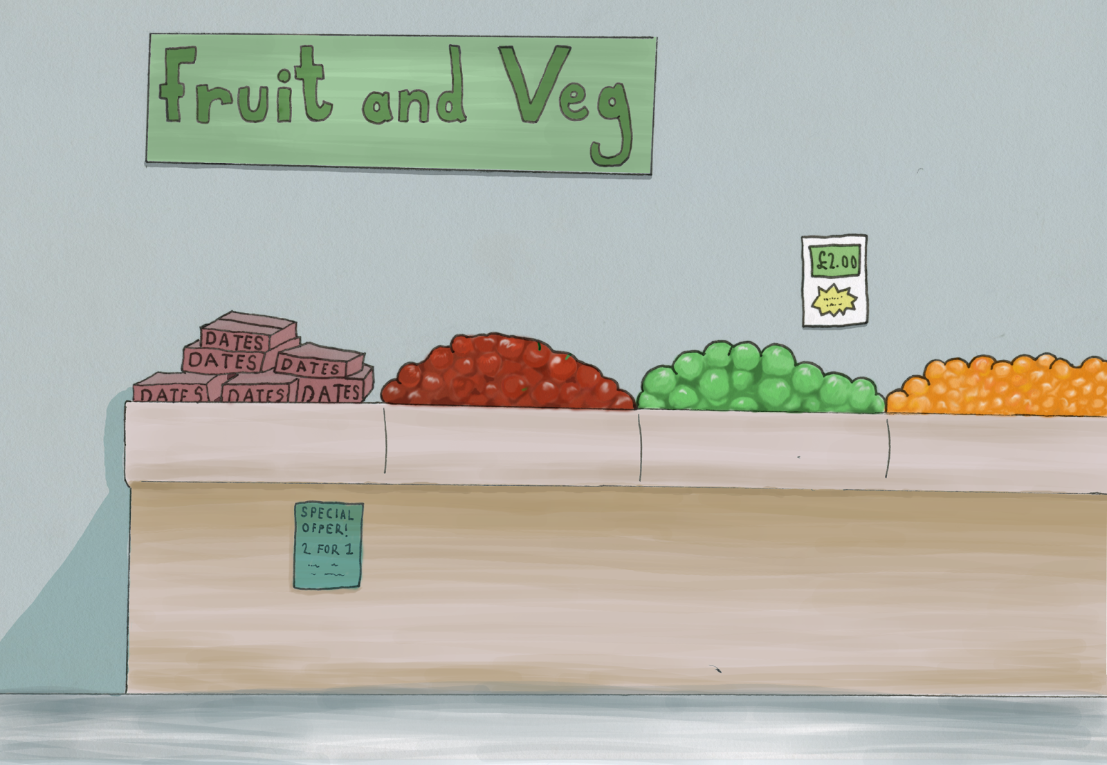
Blind Date storyboard
I have decided the story for my 'Make Em Laugh' animation will be the endeavour of a blind date -the fruit- to escape the supermarket where he is imprisoned. I have drawn out a loose storyboard below. The story begins with a wide shot of the supermarket fruit and veg section to establish the scene, and will show the dates journey to try and escape; he punches his way out of the box and heroically slides down a rope, dodging trollies as he tries to find his way out. Eventually he gets to the door and gazes out in amazement before the automatic doors chop him in half. Hopefully this last shot of the animation will cement the 'funny' side of the animation if the idea of the 'blind date' pun doesnt.


Tuesday, February 7, 2017
Make Em Laugh- Blind Date ideas
I have decided my theme for this brief will be under the theme of 'Blind date,' however I want to put a twist on it by using a date-as in the fruit- that is blind. I have thought of a few scenarios that the blind dates could be put into; such as perhaps a tomato or some other type of fruit is going on a blind date, only to turn up and find that his blind date was a blind date the whole time. I liked this idea but thought it might be hard for people to understand what the date actually was. I also thought maybe just a montage of a hoard of blind dates fumbling around and trying to go about life would be quite funny and would appeal to that random sort of humour that is popular with teenagers and young adults.
My other idea was the date is trying to escape from the supermarket he is imprisoned in- with great difficulty, and perhaps a grape guide dog. I think i like this idea the most and it would be the most fun to work on, and i think i could make use of sound by perhaps putting mission impossible music or the great escape music to make it funnier.
My other idea was the date is trying to escape from the supermarket he is imprisoned in- with great difficulty, and perhaps a grape guide dog. I think i like this idea the most and it would be the most fun to work on, and i think i could make use of sound by perhaps putting mission impossible music or the great escape music to make it funnier.
Monday, February 6, 2017
The Golden Age
 The Golden Age Of Animation is a period in animation history that is generally agreed to have begun on November 18th, 1928, with the release of Steamboat Willie, and cemented with Fleischer's, Warner's and MGM's rise to prominence in the years following. Feature length animation also began during this period, most notably with Walt Disney's first films: Snow White and the Seven Dwarfs. For many people animation begins and ends with Disney films. Many of the most iconic animated stars were born in this period, such as Daffy Duck, Bugs Bunny, Tom and Jerry, Woody the Woodpecker etc.
 Felix the Cat and Out of the Inkwell were the only animated series of prominence prior to 1928.
In 1937, Disney's innovative first full length animated feature, Snow White and the Seven Dwarfs, was released to critical acclaim and worldwide success. In order to expand and meet the expectations of his audience, Walt increased the size of his studio with the profits from the film.
By 1932 Walt Disney had realized the success of animated films depended upon telling emotionally gripping stories that would grab the audience.This realization led to an important innovation around 1932 and 1933: a "story department," separate from the animators, with storyboard artists who would be dedicated to working on a "story development" phase of the production process. In turn, Disney's continued emphasis on story development and characterization resulted in another hit in 1933: Three Little Pigs, which is seen as the first cartoon in which multiple characters displayed unique, individual personalities and is still considered to be the most successful animated short of all time, and also featured the hit song that became the anthem in fighting the Great Depression: "Who's Afraid of the Big Bad Wolf". After the success of Snow White Disney went on to produce Pinocchio in 1940. It was considered a stunning achievement both technically and artistically, costing twice as much as Snow White, but because of World War II's affect on foreign release market, it was not financially successful.

Subscribe to:
Comments (Atom)